Analyzing Past Crypto Bull Run Charts
The cryptocurrency market’s history is marked by cycles of dramatic booms and busts. Understanding these past bull runs, particularly their chart patterns, can provide valuable insights, though it’s crucial to remember that past performance is not indicative of future results.
One of the most notable bull runs occurred in 2017. The Bitcoin chart, the bellwether for the crypto market, experienced a parabolic surge. Starting around $1,000 at the beginning of the year, it climbed to nearly $20,000 by December. This exponential growth was fueled by increased mainstream awareness, regulatory developments (or lack thereof leading to speculative frenzies), and the emergence of numerous altcoins offering seemingly innovative solutions. The chart displayed a near-vertical ascent in the final months, a hallmark of unsustainable bubble-like behavior.
Analyzing the 2017 Bitcoin chart reveals several key characteristics. Firstly, there were periods of consolidation followed by sharp upward movements. These consolidations often appeared as flags or pennants on smaller timeframes, indicating a temporary pause before the bullish trend resumed. Secondly, the volume generally increased along with the price, suggesting strong buying pressure behind the rally. However, near the peak, divergences started to appear. The price continued to make higher highs, but momentum indicators like the Relative Strength Index (RSI) showed lower highs, signaling weakening momentum and a potential reversal.
Following the peak, the chart experienced a steep correction. This downturn was characterized by rapid price declines, often in the form of cascading red candles. Support levels were easily broken, and fear gripped the market. The volume during this correction was also high, indicating significant selling pressure. It took Bitcoin several years to recover from this bear market and surpass its previous all-time high.
Another significant bull run occurred in 2020-2021. This cycle differed from 2017 in several ways. Institutional involvement increased significantly, with companies like MicroStrategy and Tesla adding Bitcoin to their balance sheets. This provided legitimacy and stability to the market. Furthermore, the rise of decentralized finance (DeFi) and Non-Fungible Tokens (NFTs) added new layers of innovation and speculation. The Bitcoin chart during this period showed a more gradual, albeit still substantial, rise compared to 2017’s parabolic surge. The pullbacks were generally shallower, and the recovery times were faster.
Analyzing the 2020-2021 chart reveals a more sustained uptrend. While volatility was still present, the overall trend was clearly upward. Fibonacci retracement levels were frequently used to identify potential support and resistance areas. On-chain analysis, such as tracking the number of active addresses and the flow of Bitcoin between exchanges, provided additional insights into the market’s health. This bull run also experienced corrections, but they were often viewed as buying opportunities by institutional investors and long-term holders.
In conclusion, while specific patterns may vary, previous crypto bull run charts share common characteristics such as periods of rapid price appreciation, increased volume, and eventual corrections. Analyzing these patterns, along with fundamental analysis and on-chain data, can help investors make more informed decisions. However, it is vital to understand that the crypto market is highly volatile and speculative, and all investments carry significant risk.
 900×536 historical bitcoin cycles hint charging btc bull run from www.reddit.com
  1669×967 explained bitcoin halving nex crypto bull run from fintelegram.com
  1200×605 crypto bull run chart ally brittni from deinaysalaidh.pages.dev
  1472×888 history repeats bitcoin reach bull cycle from cryptopotato.com
  474×331 charts show bitcoin bull run isnt stopping from coingape.com
  458×318 whats bitcoins bull run bitcoin bull run from academy.moralis.io
  2868×1654 bitcoin bull run bear market weekly chart june bitstamp from www.tradingview.com
  1306×775 bitcoin bull cycle pattern bncblx from www.tradingview.com
  1024×623 understanding bitcoin bull run cycle pintu academy from pintu.co.id
  2048×927 btc bull cycle chart comparison side side major from www.reddit.com
  700×450 long bitcoin bull run proponents myriad from news.bitcoin.com
  1470×856 historical data bull run btc ltc peak from www.reddit.com
 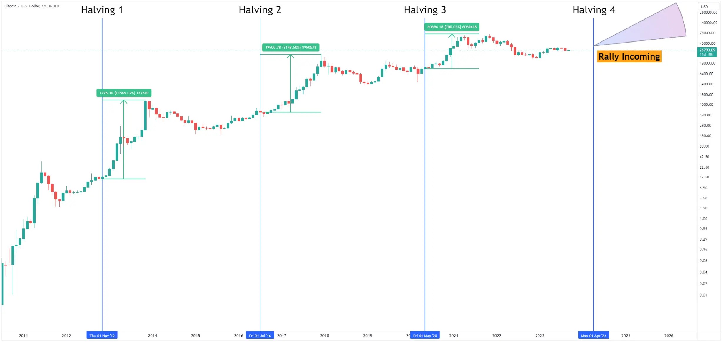 2456×1166 understanding bull cycles cryptocurrency market bulb from www.bulbapp.io
  1172×500 history bitcoin bull bear markets from altcoininvestor.com
  474×328 bitcoin historic chart suggests bull run starting from www.bitcoininsider.org
  1600×1543 bitcoin sets stage bull run heres from finbold.com
 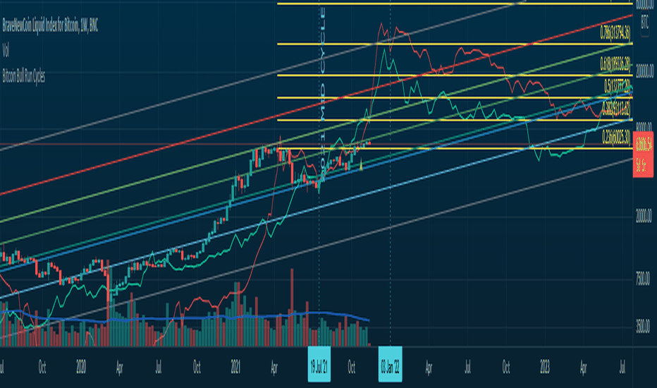 932×550 bullrun indicadores estrategias tradingview from br.tradingview.com
  859×421 bull run crypto est ce le prochain aura lieu en from investx.fr
  1024×611 crypto bull run monthly charts from www.stopsaving.com
  1974×1226 bitcoin bull market dip cryptocurrencybtc usd seeking alpha from seekingalpha.com
  1980×1170 crypto bull run history rise bitcoin altcoins techopedia from www.techopedia.com
  474×263 understanding bitcoins bull run bitcoin predictions moralis from academy.moralis.io
  1748×928 bull runs rcryptocurrency from www.reddit.com
  1024×530 bull run part bitcoin crypto guide from www.altcoinbuzz.io
  2048×517 crypto bull run happening coincheckup from coincheckup.com
  1024×587 officially bull run crypto university from cryptouniversity.network
  1024×720 crypto bull run phases easy explanation mudrex learn from mudrex.com
  1024×480 crypto bull run officially started insights from crypto.news
  1200×693 bull run looked compared from cryptocurrencyfacts.com
  1200×630 crypto token development crypto exchange development from www.blockchainappfactory.com
  1608×775 soleiman erfan crypto twitter bull run chart current from twitter.com
  1200×670 coins buy crypto bull run from www.techopedia.com
  1188×650 promising cryptos buy bull run coinrule blog from coinrule.com