Understanding Bitcoin bull runs is crucial for investors navigating the volatile cryptocurrency market. Comparing historical bull runs through charting helps identify potential patterns, similarities, and differences that can inform future investment strategies. However, it’s essential to remember that past performance is not indicative of future results.
A typical bull run comparison chart plots Bitcoin’s price against time for various historical bullish periods. These periods are usually defined as sustained price increases of a certain percentage (e.g., 100% or more) from a previous low point. Several metrics can be used on these charts to gain valuable insights:
- Duration: The time it takes for a bull run to unfold. Some bull runs may be relatively short and intense, while others can be longer and more gradual. Comparing durations reveals whether the current market conditions are more conducive to a quick surge or a prolonged climb.
- Magnitude: The percentage increase in Bitcoin’s price from the start to the peak of the bull run. This provides a measure of the overall profitability potential. Larger magnitude bull runs offer greater returns but also carry a higher risk of significant corrections.
- Shape: Visualizing the shape of each bull run – whether it’s a parabolic curve, a steady upward trend, or a series of peaks and dips – reveals how the market sentiment evolved during that period. A parabolic shape suggests heightened speculation and a higher risk of a sharp correction.
- Triggers: Understanding the catalysts that initiated each bull run is crucial. These triggers might include regulatory changes, institutional adoption, technological advancements, or macroeconomic factors. Identifying potential triggers in the current market helps assess the likelihood of a new bull run.
- Corrections: Even during bull runs, Bitcoin experiences significant corrections. Analyzing the frequency, magnitude, and duration of these corrections provides insights into market volatility and helps investors develop strategies for managing risk during upward trends.
Comparing past bull runs allows for a broader perspective. For example, the 2017 bull run, fueled by retail interest and Initial Coin Offerings (ICOs), displayed a parabolic shape and ended in a sharp correction. In contrast, the 2020-2021 bull run saw increased institutional adoption and a more gradual, albeit volatile, climb to new all-time highs. These differences highlight the changing market dynamics and the influence of various factors on Bitcoin’s price.
However, comparing these charts is not without limitations. Market conditions are constantly evolving, and each bull run is unique. Over-reliance on historical data can lead to flawed predictions. Factors like increased market maturity, regulatory scrutiny, and the emergence of new cryptocurrencies can significantly impact future Bitcoin price movements.
Ultimately, comparing Bitcoin bull run charts is a valuable tool for understanding market history and potential patterns. It helps investors develop informed perspectives on risk management and profitability. However, it’s crucial to supplement this analysis with a comprehensive understanding of current market conditions, technological advancements, and macroeconomic factors to make well-informed investment decisions.
 1249×681 bitcoin tendency differences today from elitecurrensea.com
  800×477 bitcoin macro news case bitcoin from casebitcoin.com
  2868×1654 bitcoin bull run bear market weekly chart june bitstamp from www.tradingview.com
  2048×927 btc bull cycle chart comparison side side major from www.reddit.com
  474×331 charts show bitcoin bull run isnt stopping from coingape.com
  1948×1211 bullrun bullrun speculation rcryptocurrency from www.reddit.com
  900×536 historical bitcoin cycles hint charging btc bull run from www.reddit.com
  474×340 bitcoin halving bull run cycle from medium.com
  474×201 bull run historic data bitcoin suggests from www.tradingview.com
  1200×693 bull run looked compared from cryptocurrencyfacts.com
  1234×588 bull run imminent hodl waves chart shows bitcoin hasnt moved from news.bitcoin.com
  1200×605 bitcoin exclusive bull run technical analysis comprehensive guide from coinmarketcap.com
  474×328 bitcoin historic chart suggests bull run starting from www.bitcoininsider.org
  1536×629 bitcoin bullrun cest le moment pour une phase haussiere from www.cointribune.com
  1470×856 historical data bull run btc ltc peak from www.reddit.com
  1920×1080 bitcoin bull run from blog.bitpanda.com
  1904×937 bitcoin bullrun halving und charts from bitcoin-2go.de
  1600×1543 bitcoin sets stage bull run heres from finbold.com
  474×272 bullish chart ive cycle rbitcoin from www.reddit.com
  474×263 understanding bitcoins bull run bitcoin predictions moralis from moralismoney.com
 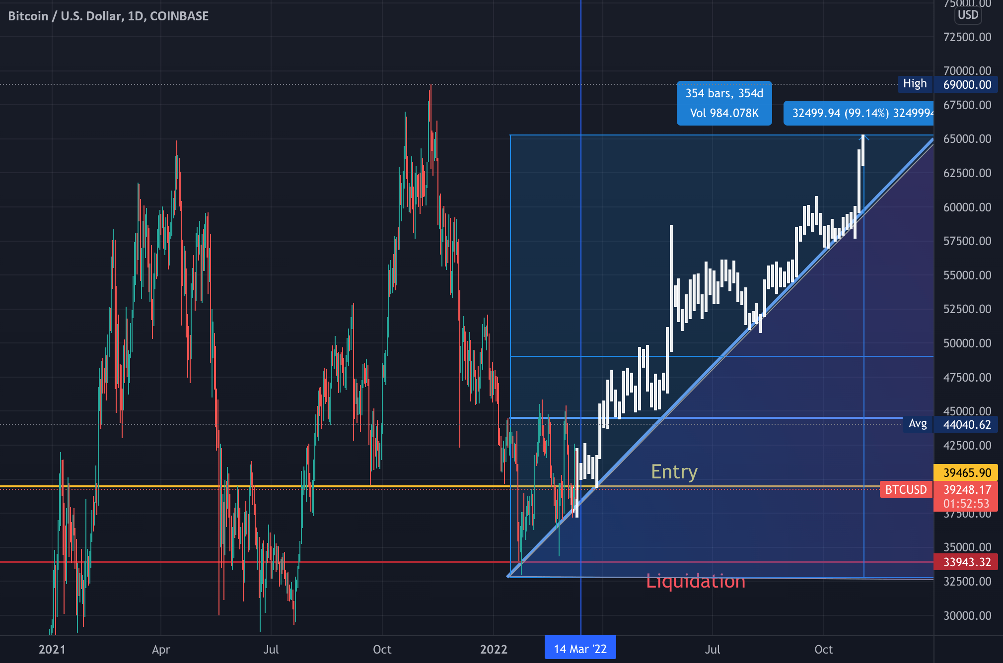 2020×1336 bitcoin bull run year coinbasebtcusd from www.tradingview.com
  1280×720 bitcoin btc truth bull run from www.youtube.com
  1980×1170 crypto bull run history rise bitcoin altcoins techopedia from www.techopedia.com
  1224×605 bitcoin btc price bull run continue november from coingape.com
  1792×1024 bitcoin average cycle count suggests bull run months from bitcoinist.com
  1792×1024 bitcoin btc historical data signals october bull run kickoff from bitcoinist.com
  1472×888 history repeats bitcoin reach bull from www.bitcoininsider.org
  1669×967 explained bitcoin halving nex crypto bull run from fintelegram.com
  458×318 whats bitcoins bull run bitcoin bull run from moralismoney.com
  1200×1554 beginning bitcoin bull run bull run bitcoin infographic from www.pinterest.com
  1024×530 bull run part bitcoin crypto guide from www.altcoinbuzz.io
Leave a Reply